
Project Overview
The aim of this theoretical redesign project was to enhance the user experience of the archaic, sixteen-year-old Washington Department of Licensing website, thereby allowing users to access the full extent of information and online services available from the agency.
The Problem
The Department of Licensing's outdated website suffered from several issues, including excessive content, lack of task clarity, an overwhelming amount of information that made it hard for users to find what they needed, and a confusing navigation system. Moreover, the pre-application process was also convoluted, making the website even more challenging for users to use.
Goals
1. Add a top navigation bar
2. Create accordion boxes to organize content
3. Refine and simplify the footer
4. Remove unnecessary tertiary navigation
Heuristic Evaluation
By performing a heuristic evaluation on the old Washington Department of Licensing website, we collected the following significant discoveries.
-
Confusing Navigation System: The website lacks a primary navigation bar, is inundated with tacky hyperlinks, has confusing tertiary sidebar navigation, and has a copy-heavy footer.
-
Copy Heavy: The website was copy heavy and the large blocks of text made it difficult to find important information.
-
Outdated Visual Design: The design is clunky with little white space making it hard to read.
-
Excessive Redundancy: There is an excessive amount of repeated information and hyperlinks which confuses the user.
User Interviews & Key Findings
Motivations
-
To inspire new interests and hobbies in their children
-
To provide "fun" learning opportunities
-
To facilitate in-person activity engagement
-
To cultivate social skills and teamwork in their children
Pain Points
-
Concerns surrounding their children's safety and security
-
High, inaccessible program costs
-
Poor communication from the organization
-
Limited program availability/extensive waitlists

User Persona
Amelia Garcia
Amelia is a 25-year-old marketing director who has recently moved from Los Angeles to Seattle, Washington. She is career-focused and works remotely which enables her to also pursue he passion for travel. Amelia needs to transfer her out-of-state driver's license promptly so she can start exploring her new home state.
User Journey Map
2. Begins doing research but wastes time on websites with only "sold out" programs.
4. Discovers AirSci and finds the program information she needs.
6. Receives newsletter with registration dates and successfully registers her child for a program.
2
4
6
1
3
5
1. Susana wants to sign her child up for an educational summer camp.
3. Misses many registration deadlines and worries that her child won't get into a program due to limited availability and waitlists.
5. Signs up for AirSci newsletter.
Opportunities
In mapping out Susana's journey to register her child for an educational program, I discovered the greatest opportunities to improve the user experience. These opportunities include implementing a real-time headcount ticker on each program to view how many seats are currently available and creating a newsletter subscription modal so users can get the most up-to-date information directly to their email inboxes.
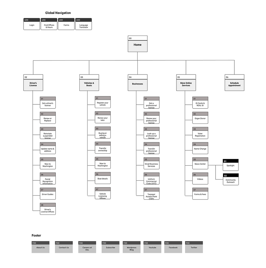
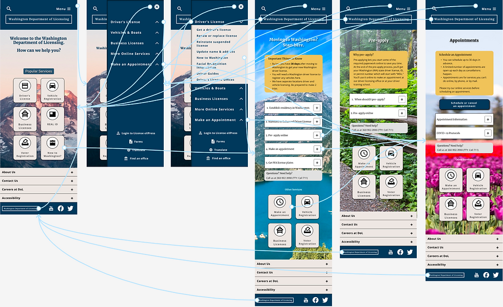
Information Architecture
The AirSci navigation was originally organized randomly, so we used card sorting to categorize the information architecture. We added new links to the main navigation, a top global navigation bar for easy access to often-used links, and improved the footer to make it more usable.
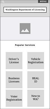
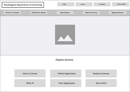
Low-Fidelity Wireframes
After sketching, I crystallized my vision by creating low-fidelity wireframes that focus primarily on the user experience, task flows, and information architecture.
Prototype
After wireframing, I moved into high-fidelity prototyping implementing user experience as well as visual design to bring my concept to life.
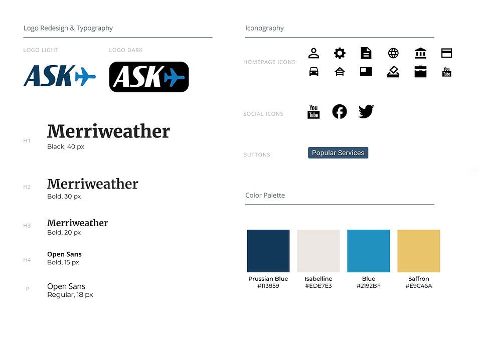
Branding & Style Guide
To inject some liveliness into the Airway Science website, we revamped its grayscale color palette which appeared monotonous for a youth-oriented organization. Our solution involved incorporating playful blue and orange hues, designing identifiable components, and integrating more relevant imagery.
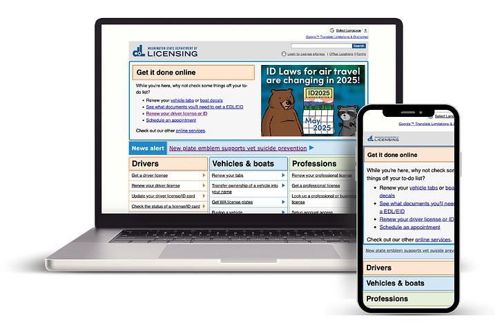
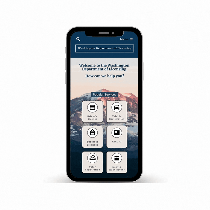
Final Mobile Redesign

Final Desktop Redesign
Impact
The main goal of this project was to improve the old website by eliminating repetitive content, streamlining text-heavy sections through the use of accordion menus, and introducing a new primary navigation bar to enhance user-friendliness. The most significant hurdle I faced was reorganizing the website's hyperlinks through card-sorting to create a simple and enjoyable browsing experience.
Next Steps
Given additional time, we would improve the information architecture, elevate the visual design, and streamline the user flow for various government agency services.